Magenta Beers
I created a beer label and packaging aimed towards consumers in the design field.

Timeline
2019
My role
Packaging design, branding, photography
Tools
Illustrator, Indesign, Photoshop
From red to magenta
Beers have a very large target audience. In recent years, many beer brands have been using their design to stand out or target specific demographics.
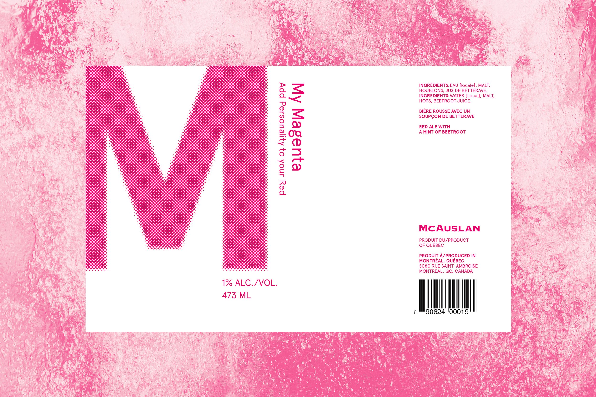
While red ales are a common type of beer, using "Magenta" instead makes a call to designers who are familiar with the CMYK (Cyan-Magenta-Yellow-Black) print colors. The color magenta is unique, passionate and has more character compared to red.

Communicating brand presence
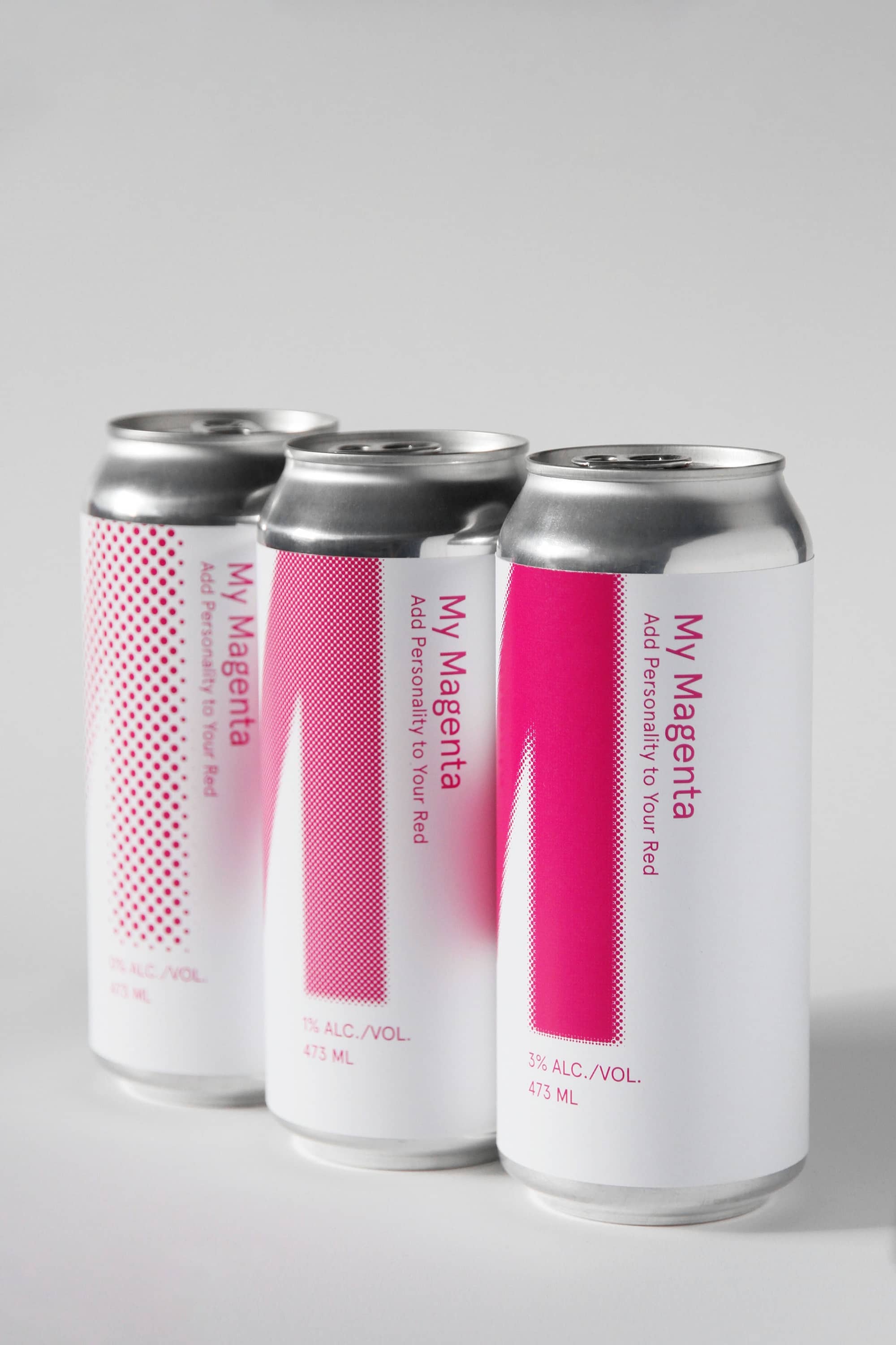
The “M” of magenta became the central identity of the beers. Its shades varied from light to strong to accompany the different alcohol levels of the line. The secondary information was kept as minimal as can be for the beers to distinguish themselves on a shelf.
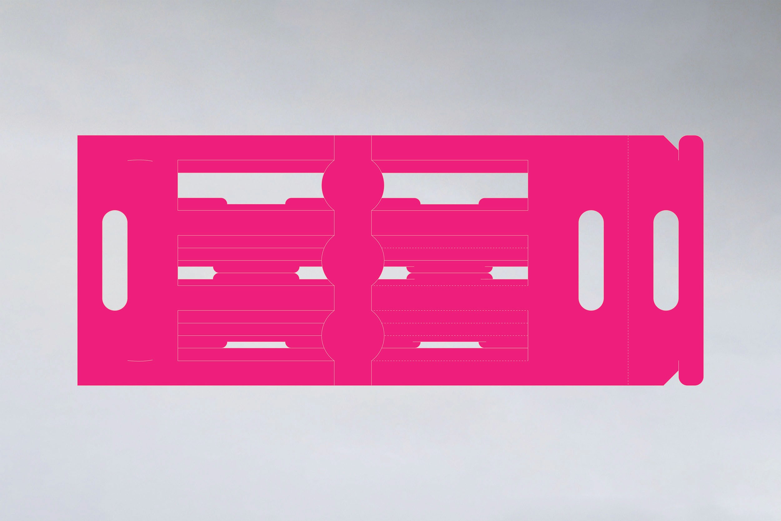
Functional carrier
A bare cardboard carrier was wrapped around the cans and constructed in a way to make the beer labels visible and for people to carry them comfortably without the use of an additional bag.